Float Input Placeholder Example With Tailwind CSS
Learn how to enhance your forms with float placeholders using Tailwind CSS. This guide provides a clear example of implementing float placeholders in both HTML and React, showcasing practical code snippets and styling techniques for a sleek, user-friendly interface.

If you want to add a little more visuality to our input, we can use float placeholder. Here is an example written with Tailwind CSS.
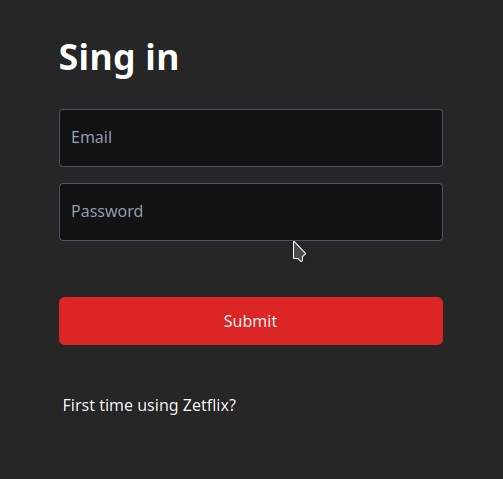 float input placeholder example with tailwind css gif
1
2
3
4
5
6
7
8
9
10
11
12
13
14
<div class="relative">
  <input
    id="password"
    type="password"
    placeholder=""
    class="peer bg-black bg-opacity-50 px-4 pt-6 pb-2 w-full rounded border border-slate-600 text-white focus:ring-2 focus:ring-white outline-none invalid:border-red-500"
  />
  <label
    for="password"
    class="absolute text-slate-400 left-3 scale-75 top-2 peer-placeholder-shown:scale-100 peer-placeholder-shown:top-4 peer-focus:scale-75 peer-focus:top-2 duration-300"
  >
    Password
  </label>
</div>
If you want to use it in React, there is an example usage below.
1
2
3
4
5
6
7
8
9
10
11
12
13
14
15
16
17
18
19
20
21
22
23
24
25
26
import { ComponentPropsWithoutRef } from "react";

type InputProps = ComponentPropsWithoutRef<"input"> & {
  label: string;
};

function Input({ label, type }: InputProps) {
  return (
    <div className="relative">
      <input
        id={label}
        type={type}
        placeholder=""
        className="peer bg-black bg-opacity-50 px-4 pt-6 pb-2 w-full rounded border border-slate-600 text-white focus:ring-2 focus:ring-white outline-none invalid:border-red-500"
      />
      <label
        htmlFor={label}
        className="absolute text-slate-400 left-3 scale-75 top-2 peer-placeholder-shown:scale-100 peer-placeholder-shown:top-4 peer-focus:scale-75 peer-focus:top-2 duration-300"
      >
        {label}
      </label>
    </div>
  );
}

export default Input;
This post is licensed under CC BY 4.0 by the author.
Comments powered by Disqus.